
The iPeople personal branding course
Six modules and thirty lessons to build your personal branding on LinkedIn. The first lessons of each course are open; the rest unlocks with a free account.
All courses are free: an iPeople account is all it takes. No paid plan required.

People don’t read your profile. They skim it. In the first three seconds, the eye stops on three things, always in the same order: the photo, the name, the headline underneath the name. Everything else — the about section, the experience, the skills — only gets read if those three elements have already answered an implicit question: "is this worth continuing?"
This holds whether it’s a recruiter skimming a hundred profiles in an afternoon, or a potential client who got your name from a colleague and wants to quickly work out who you are. The mechanism is identical in both cases: a fast first filter, and only if the profile clears it, a closer read of everything else.
What happens if the filter doesn’t hold
When the photo, name and headline don’t give a strong enough signal, most people don’t keep reading: they go back, open the next profile in the list, and your about section — however well written — never gets read at all. It isn’t a punishment, it’s simply how people behave when they have little time and many alternatives. The next profile in the same search gets the attention yours lost in those first three seconds.
Why it’s worth starting here
Many professionals spend hours polishing the about section and neglect the headline — which is actually the most-read text on the whole profile, because it shows up everywhere your name does: in search results, under your comments, in your invitations, even in the notifications LinkedIn sends your connections when you change jobs. Before writing a single line of your about section, it’s worth asking whether the headline is already doing its job.
The difference is easiest to see side by side. "Marketing Manager at Acme Inc." is correct but says nothing specific: you can’t tell the industry, the type of company, or what that person does better than anyone else with the same title. "I help consumer brands get into European retail" takes about the same space, but immediately answers the question the reader is already asking: can this person be useful to me?
- Does your headline say who you help, or just your job title?
- If someone only read your photo, name and headline, would they understand what you do and for whom?
- Is your profile photo from the last couple of years, or from an earlier stage of your career?
None of this needs a full afternoon. Twenty minutes is enough to look at these three elements with fresh eyes — maybe asking a colleague to glance at your profile for thirty seconds and tell you what they understood, before reading a single line of the about section.
This applies no matter your field. A lawyer, an architect, an executive and a management consultant have very different things to say, but the reading mechanism is identical: whoever looks at their profile for the first time stops on the same three points before deciding whether to keep going. The rest of this module goes into what to write in each section — this first lesson is about the logic that holds them together: first you earn the attention in those first three seconds, then you earn the trust with everything else.
⚠️ A common mistake
- Leaving the headline as a plain job title ("Sales Manager at Acme") — correct but silent: it doesn’t say who you help or what problem you solve.
- Polishing the about section while neglecting the photo or the cover image, which are seen first.
- Updating the photo once and never touching it again for years, even as your professional context changes.
Quick check
In the first seconds of reading a profile, where does the eye stop, in what order?
Photo, name and headline are what decide whether the reading continues.
Why does the headline matter more than it seems?
The headline appears in search results, under comments, in invitations — far more often than the about section.
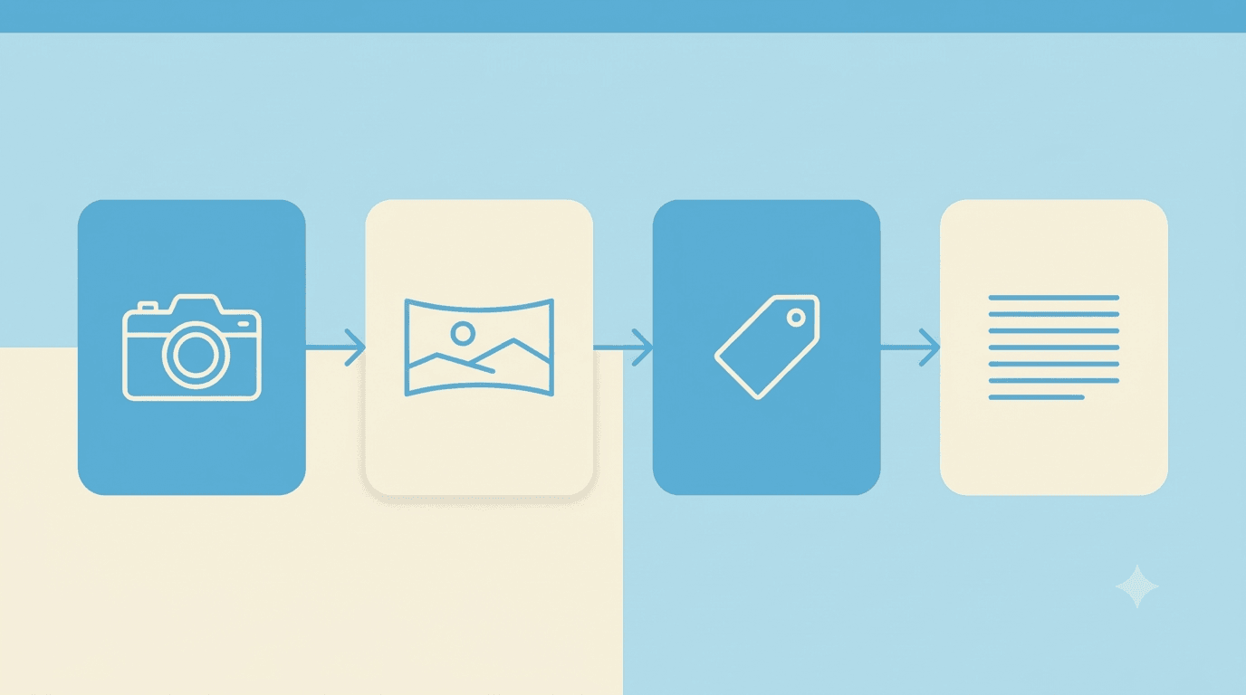
Four elements do the most visible part of the work: the profile photo, the cover image, the headline, the about section. None of them takes more than twenty minutes to get right, but together they radically change the first impression — they’re also the only four elements that show up, in one form or another, every time your name appears anywhere on LinkedIn: search results, comments, connection invitations. It’s worth treating them as one package, not four separate boxes to fill in.
Profile photo
A well-lit face, a neutral background, a shot from the chest up. You don’t need a professional photographer: you need natural light — better near a window than under office fluorescents — and an expression close to how you’d actually present yourself at a work meeting. A grainy photo, snapped in passing, or badly cropped from a group shot communicates a lack of care, even when the rest of the profile is flawless.
A common mistake is a photo that’s too formal, almost like an ID picture: it comes across as stiff, and on a platform where people scroll quickly it risks going unnoticed. The goal isn’t to look like an actor in an ad, but like a real person it would be pleasant to talk to for five minutes.
Cover image
It’s the most wasted space on the profile: most people leave it on the default blue, or drop in a generic image pulled from the internet that says nothing specific about who they are. It’s actually free advertising space, always visible right under the photo — you can use it for a line summing up your value proposition, for your business logo, or for an image that gives context to your field.
A management consultant might use a clean shot of their office or of an event where they spoke; someone working internationally might choose a bilingual line. What matters is that the choice isn’t random — almost no one notices it consciously, but everyone sees it, and that’s exactly what makes it valuable: it communicates without asking for attention.
Headline
Beyond the role, it says who you help and what problem you solve. "I help manufacturing SMEs cut logistics costs" communicates far more than "Consultant at Studio Rossi" — the first version makes it clear in three seconds whether it’s worth reading on, the second requires the reader to go find that information elsewhere, assuming they even want to.
You don’t have to give up the role or the company: you can write "I help manufacturing SMEs cut logistics costs · Head of Operations, Acme Inc.", keeping both the information useful to the reader and the one that lends institutional credibility.
About section
It only gets read in full if the first two lines hold the reader’s attention — LinkedIn truncates the text after roughly 300 characters with a "see more" that has to be actively clicked, something most visitors never do. Open with the question or the problem you solve for the reader, not with your résumé: whoever lands on your profile wants to know if you can help them, not retrace your career from the beginning.
A weak opening starts with "I’m a professional with fifteen years of experience in the industry…" — true, but generic, and it delays the moment the reader discovers why they should care. An opening that works starts from the problem: "Manufacturing companies lose a meaningful share of margin to logistics inefficiencies no one measures. For fifteen years I’ve helped operations teams find them." The résumé, at that point, comes after — backing up a claim that has already earned the attention.
Quick check
Which part of the profile is most often left unused?
The cover almost always stays on the default blue, even though it’s free advertising space.
How should an effective about section open?
LinkedIn truncates the text after a few lines: the opening has to hold attention, not summarise the résumé.
Telling a role as a result, not as a job description.
The reserved lessons unlock for free when you sign up — no paid plan needed.
Sign up free to continue →Three technical details almost no one takes care of, that decide whether you get found.
The reserved lessons unlock for free when you sign up — no paid plan needed.
Sign up free to continue →A perfect but static profile is still just a business card.
The reserved lessons unlock for free when you sign up — no paid plan needed.
Sign up free to continue →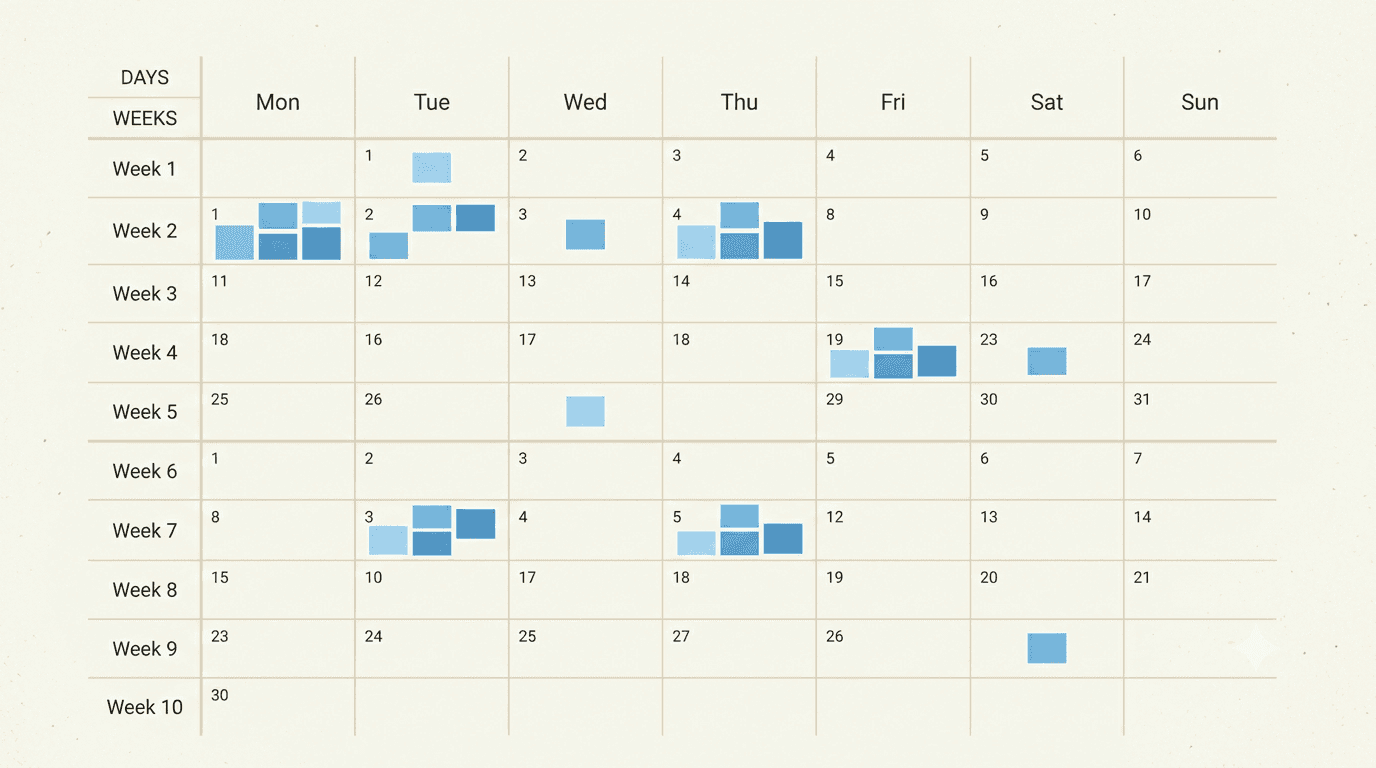
People who post "when they have an idea" post about once a month, almost always in the weeks when work slows down and some free time is left over. The problem isn’t the quality of those posts — they’re often well written too — but the fact that weeks, sometimes months, pass between one post and the next, and whoever follows the profile loses the thread before it even forms.
An editorial plan isn’t a bureaucratic constraint, it’s the difference between "I’d like to be visible on LinkedIn" and "I am visible on LinkedIn". It decides in advance, even just for the next two or three weeks, which topics to cover, at what frequency, drawing on which sources — so that when it’s time to write, you don’t start from a blank page but from an idea already sketched out.
The hidden cost of improvising
Writing without a plan doesn’t save time, it just pushes it forward: every time you sit down to write "something" without already knowing what, the time spent deciding the topic adds to the time spent writing it. With a plan, that decision is already made — all that’s left is the actual writing time, which is the shortest part of the job.
A consultant relying on the inspiration of the moment might spend twenty minutes scrolling their feed looking for an idea, write a post in another twenty, and end up having spent forty minutes for an uncertain result. With three topics already ready from the week before, the same forty minutes becomes twenty minutes of pure writing, because the "what" decision is already closed.
- In the last month, how many posts did you publish, and in which weeks?
- Do you already know what your next post will be about, or will you find out when you sit down to write?
- Do you read your sources with a specific goal, or just to stay up to date?
⚠️ A common misconception
- Thinking an editorial plan kills spontaneity — it actually frees up time to write better, it doesn’t impose a rigid script.
- Putting off planning until "I have more time", which in practice means never planning at all.
Quick check
What’s the main problem with people who post "when they have an idea"?
Quality is often not the issue — consistency is, and that’s what builds a recognisable presence over time.
Why does an editorial plan save time, even though it requires stopping to plan?
Deciding the topic in advance leaves, at writing time, only the writing itself — the shortest part of the job.

An editorial plan rests on three decisions, made once and then periodically revisited: which topics to own, at what rhythm to publish, which sources to draw fresh material from. They’re three different levers, and it’s worth treating them separately instead of blending them into one vague idea of "what to write".
Topics
Topics are the two or three areas you want to be known for — not the things you could theoretically talk about, but the ones you want people to think of you for first. A fractional CFO who owns "cost control for SMEs" and "cash flow for growing companies" builds, post after post, a precise association in the reader’s mind. Someone who ranges over whatever comes to mind builds no specific association at all.
Rhythm
Rhythm is how often you post per week or month, and it’s the only one of the three levers that has to be calibrated to your actual situation, not to some abstract ideal. One post a week published consistently for a year is worth more than three posts a week for a month followed by three months of silence — consistency of rhythm matters more than its intensity.
Sources
Sources are where the raw material comes from that topics turn into posts: industry newsletters, reports, client conversations, observations from your own day-to-day work. Without fresh sources, even the clearest topics end up repeating themselves — sources are what keeps the plan fresh over time, instead of a static list of the same subjects.
The three levers hold together: topics that are too broad make any source "fit", diluting the positioning; a rhythm too ambitious for the available sources forces generic filler content; excellent sources disconnected from the topics produce interesting posts that don’t match the image you’re trying to build.
Quick check
What sets a good "topic" apart from a generic subject?
Topics build a specific association in the reader’s mind; ranging over everything builds no association at all.
Why does consistency of rhythm matter more than its intensity?
One post a week for a year beats three posts a week for a month followed by months of silence.
Not every source deserves a place in the plan — some need pruning.
The reserved lessons unlock for free when you sign up — no paid plan needed.
Sign up free to continue →A topic isn’t a post yet — there’s a missing step in between, often skipped.
The reserved lessons unlock for free when you sign up — no paid plan needed.
Sign up free to continue →An editorial plan isn’t static: it adjusts by watching what actually happens to your posts.
The reserved lessons unlock for free when you sign up — no paid plan needed.
Sign up free to continue →
Two people can write a post on the same topic, with the same information, and get completely different reactions. The difference isn’t in the content — it’s in the tone: how the words are chosen, the rhythm of the sentences, the level of formality, the presence or absence of a personal point of view. Tone is what makes a post feel written by a real person, rather than by a communications office.
Tone isn’t style, it’s consistency
Many people confuse tone with a style to imitate — "write like the posts that perform well" — but the tone that truly convinces is the one consistent with how that person actually speaks in real life. A reserved executive who suddenly writes enthusiastic posts full of exclamation marks isn’t finding their voice, they’re putting on a costume that anyone who knows them recognises instantly as not theirs.
The simplest test: if you read the post aloud to someone who knows you, would it sound like you talking, or like a press release read by you? If the answer is the second one, the tone needs revisiting, no matter how technically correct the text is.
Why the audience feels it even without being able to name it
Readers don’t consciously analyse tone, but they perceive it anyway: a text that sounds genuine builds trust even before being judged on its content, while a text that sounds artificial — too polished, too generic, too similar to a thousand others — gets skimmed without leaving anything behind, even when it says sensible things.
- If you read your last post aloud, would it sound like how you really talk?
- Is there a phrase you’d always use yourself, or does it sound borrowed from a generic LinkedIn-post template?
- Does the register (formal, direct, ironic) shift from one post to the next, or stay recognisable?
Quick check
What sets "tone" apart from a "style to imitate"?
An effective tone comes from how that person really speaks, not from a model copied from other people’s posts.
Why does the audience perceive tone even without being able to analyse it?
Trust often forms before, and regardless of, a conscious evaluation of the content.

Asking someone to describe their tone with adjectives ("professional but approachable", "direct and pragmatic") almost always produces generic answers that could fit anyone. A more reliable approach is to start from concrete examples already written — old emails, messages, notes from a presentation — and observe what they have in common, instead of describing them in the abstract.
What to look for in an already-written text
Some concrete signals to notice: average sentence length (short and direct, or elaborate and more reflective), the presence of rhetorical questions, the use of personal examples versus general statements, the level of formality in greetings and sign-offs. These details, added together, define a tone far more precisely than any adjective.
A useful exercise: take three emails or messages written at different times, without thinking about tone while writing them, and underline the sentences that, read again today, sound most "you" — the ones you wouldn’t change even if you had to rewrite them. Those sentences, put together, are a more reliable sample than any list of adjectives.
Tone shifts with context, but has a stable core
It’s normal to write slightly differently to a client than to a colleague, or in an informal message versus a business proposal — but under those variations a recognisable core remains: the words you’d always avoid, the level of irony that comes naturally to you, how you open and close an argument. It’s that core, not the more formal or informal version, that a LinkedIn post should carry.
✓ A concrete exercise
- Gather 3-4 texts written without thinking about tone (emails, messages) and underline the sentences most "you".
- Compare the underlined lines: recurrence, not any single sentence, points to your real tone.
Quick check
Why is describing your own tone with generic adjectives unreliable?
You need concrete examples — old texts written without thinking about tone — not abstract descriptions that fit everyone.
What stays stable in a person’s tone, even when the register shifts from one context to another?
Beneath register shifts, a stable core remains that a post should always carry.
A tone that lands in one post and gets lost in the next confuses more than a mediocre but steady tone.
The reserved lessons unlock for free when you sign up — no paid plan needed.
Sign up free to continue →Two opposite drifts, both easy to spot once you know what to look for.
The reserved lessons unlock for free when you sign up — no paid plan needed.
Sign up free to continue →Getting help with writing doesn’t mean sounding like everyone else.
The reserved lessons unlock for free when you sign up — no paid plan needed.
Sign up free to continue →
The number of connections on LinkedIn is probably the platform’s most misleading metric: it tells you how big the network is, but nothing about who’s actually in it. A thousand connections collected without any criteria — people met once at an event, requests accepted out of courtesy, contacts from industries entirely unrelated to your own — are worth less, in practical terms, than three hundred connections in your specific niche.
What really matters: who sees your posts
Posts published on LinkedIn reach your direct network first, and only afterwards — if they generate interaction — a wider audience. That means your network isn’t just a list of contacts, it’s the first audience for everything you publish: if that network doesn’t include the people who matter for your work — potential clients, industry peers, decision-makers — even your best post starts at a disadvantage.
A consultant who has built a network of two thousand people mostly unrelated to their field gets, on average, fewer useful reactions than a consultant with three hundred targeted connections — not because the first writes worse, but because their starting audience is less relevant to what they publish.
The number as vanity, not as a tool
It’s easy to fall into the trap of treating the connection count as a credibility signal — "I have three thousand connections, I’ve made it" — but anyone looking at a profile critically notices the quality of interactions on posts (who comments, how relevant they are) more readily than the raw number at the top of the profile. A high number with no relevant interactions can actually suggest a network gathered without any criteria.
Quick check
Why is the connection count alone a misleading metric?
A thousand generic connections weigh less than a hundred in your niche, because the network is the first audience for every post.
Why is your network more than just a list of contacts?
Posts reach the direct network first: if it doesn’t include the relevant people, even a good post starts at a disadvantage.
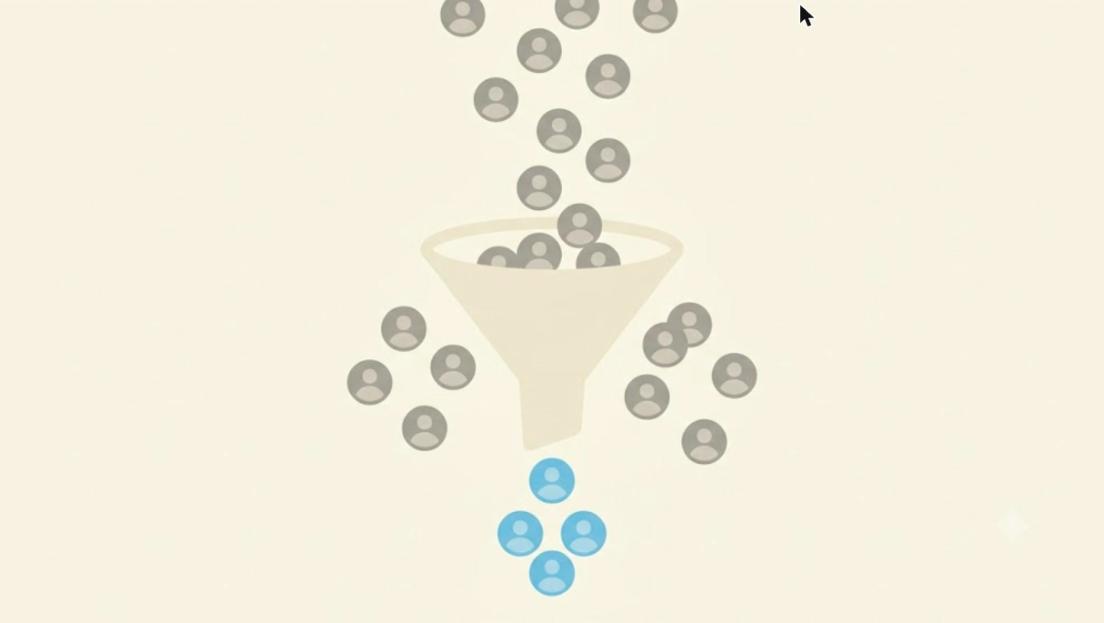
A simple rule for deciding who to invite to connect: that person fits at least one of three categories — they could be a client or a decision-maker relevant to your work, they work in your same field and could offer useful exchange, or they know people who fit the first two categories. Anyone who fits none of the three isn’t "wrong" to add, but they don’t contribute to a network built with intention.
The risk of inviting "at random"
A common mistake is using LinkedIn’s automatic suggestions as the only criterion, accepting or inviting simply whoever the platform proposes. Suggestions are based on indirect signals — same industry, mutual contacts — and sometimes work, but relying on them alone, with no criteria of your own, produces a random network over time instead of a built one.
Searching actively, not just waiting
Beyond accepting incoming requests, it’s worth actively searching for people relevant to your field or goals — decision-makers at companies that represent potential clients, colleagues talking about the same topics, people commenting knowledgeably under posts similar to yours. A personalised invitation, with a line explaining why you want to connect, has a much higher acceptance rate than a generic invitation with no message.
- Of the last ten people you added, do they fit one of the three categories, or were they added out of habit?
- Are you actively searching for new relevant connections, or just waiting for incoming requests?
- Do your invitations include a personalised message, or do you leave the generic ones LinkedIn suggests?
Quick check
Which criterion helps decide who to invite to connect?
Automatic suggestions are a starting point, not a criterion: the network is built with intention.
Why does a personalised invitation work better than a generic one?
A short message explaining why you want to connect makes the invitation more concrete and harder to ignore.
Accepting also deserves the same criteria used for inviting.
The reserved lessons unlock for free when you sign up — no paid plan needed.
Sign up free to continue →Connections need periodic review too, not just adding.
The reserved lessons unlock for free when you sign up — no paid plan needed.
Sign up free to continue →A curated network doesn’t just help people find you, it helps your posts get off to a better start.
The reserved lessons unlock for free when you sign up — no paid plan needed.
Sign up free to continue →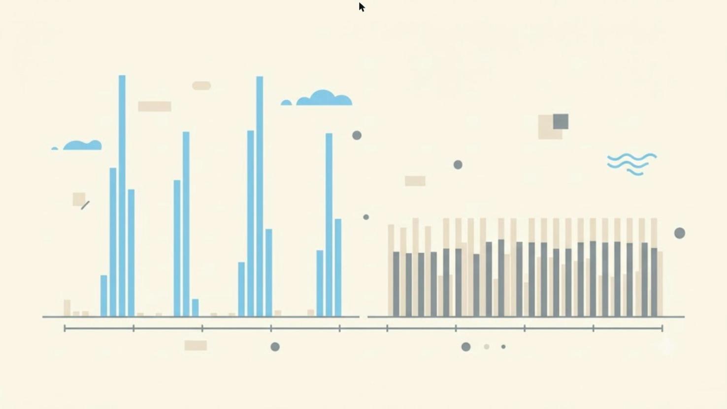
People starting out on LinkedIn often begin with enough enthusiasm to post three or four times in the first week — only to disappear for two or three months once work reclaims all their available time. The net result of this pattern is almost always worse than a more modest but uninterrupted rhythm.
Why the gap weighs more than the spike
Every time a profile stays silent for weeks, whoever was following it loses the habit of expecting something from that person — and when posts resume, it takes several cycles to rebuild the same attention. It’s the same reason a newsletter that skips two issues out of four loses more active subscribers than one that publishes less often but consistently.
Consistency also communicates something subtler: it signals that your LinkedIn presence isn’t a passing whim but a stable part of how you work. Someone who publishes regularly for a year builds a reputation that’s hard to replicate in a month of frantic posting, however well written.
The right rhythm is the sustainable one, not the ideal one
There’s no "correct" rhythm in absolute terms: one post a week is sustainable for most professionals, but even one post every two weeks, kept up consistently for a year, almost always beats three posts a week for a month followed by silence. The criterion isn’t "how ambitious is the rhythm", but "will I be able to keep it up even in the busiest weeks at work".
- In the last three months, how many weeks went by with no post at all?
- Is the rhythm you’ve set yourself realistic even in the most intense work weeks?
- Would you rather a lower but reliable rhythm, or risk repeating the "intense then silent" pattern?
Quick check
Why does a modest but consistent rhythm almost always beat an intense rhythm followed by a long silence?
The gap weighs more than the spike: rebuilding lost attention takes longer than building it the first time.
What’s the right criterion for choosing your own publishing rhythm?
The right rhythm is the one you can actually keep up, not the theoretically most effective one.

Anyone who has never tried writing consistently tends to underestimate how much time a well-crafted post really takes — not so much for the writing itself, but for everything that precedes it: reading sources, spotting a good idea, deciding the angle, finding the right words for the opening. The actual writing, once those decisions are made, often takes less time than expected.
Where the time really goes
A well-crafted post takes on average between thirty and ninety minutes overall, not written all in one sitting: a few minutes to notice an idea during the week, a quarter hour to decide the precise angle, another fifteen or twenty for a first draft, and finally a fresh re-read before publishing. Added up over a month, for someone aiming at one post a week, the total comes close to ten hours.
Ten hours a month might seem like little or a lot depending on perspective, but for a professional already working full time on their core business, finding that time consistently — not once, but month after month — is often the real obstacle, more than the difficulty of writing itself.
Why the perceived cost discourages people before they start
Many people give up before starting precisely because they imagine the cost as far higher than it really is — they think they need to dedicate a full hour in a single sitting, instead of spreading the work across small moments during the week (jotting down an idea in the morning, writing a draft over lunch, rereading it in the evening). Spreading the time out, instead of concentrating it, makes the cost far more manageable than it seems to someone who hasn’t started yet.
Quick check
Which generally takes more time: writing the post itself, or everything that comes before it?
Once the topic and angle decisions are made, the actual writing often takes less time than expected.
Why does spreading the work across small moments during the week make the cost more manageable?
Jotting down an idea, writing a draft, rereading it at different moments makes the perceived cost much lower.
There’s no universal rhythm — it depends on your role and your goal.
The reserved lessons unlock for free when you sign up — no paid plan needed.
Sign up free to continue →Delegating part of the work doesn’t mean giving up the decision over what goes out under your name.
The reserved lessons unlock for free when you sign up — no paid plan needed.
Sign up free to continue →The first month of consistency is easy — the twelfth is the real test.
The reserved lessons unlock for free when you sign up — no paid plan needed.
Sign up free to continue →
The like count under a post is the first thing you notice, simply because it’s the most visible and updates in real time right in front of whoever just published. That makes it also the easiest metric to chase out of habit — and one of the least useful when looked at alone, without other numbers alongside it.
The problem with an isolated number
A like takes almost no effort from whoever leaves it — a single click, often without even reading the whole post. A comment, by contrast, requires stopping, forming a thought, and making it public under your own name: it’s a far stronger signal of engagement, even though the raw count is almost always lower.
Two posts can have the same number of likes and a completely different story behind them: one with ten substantial comments and one with zero. The first generated a real conversation, likely because it touched a topic people had something to say about; the second just scrolled past in the feed without leaving a trace beyond a shallow click.
Looking at numbers as a proportion, not in absolute terms
A post with five hundred impressions and twenty reactions says something very different from a post with five thousand impressions and the same twenty reactions: in the first case, one person in twenty-five reacted; in the second, one in two hundred and fifty. The raw number of reactions, without knowing how many people actually saw the post, says almost nothing about its real effectiveness.
⚠️ A common mistake
- Comparing the like count between two posts without knowing how many impressions each one had.
- Considering a post "a flop" just because it has few likes, while ignoring the comments it actually generated.
Quick check
Why is the like count alone an unreliable metric?
A click with no context (how many people saw the post) tells you much less than it seems.
Why can two posts with the same number of reactions have very different effectiveness?
Twenty reactions out of five hundred impressions are very different from twenty reactions out of five thousand.
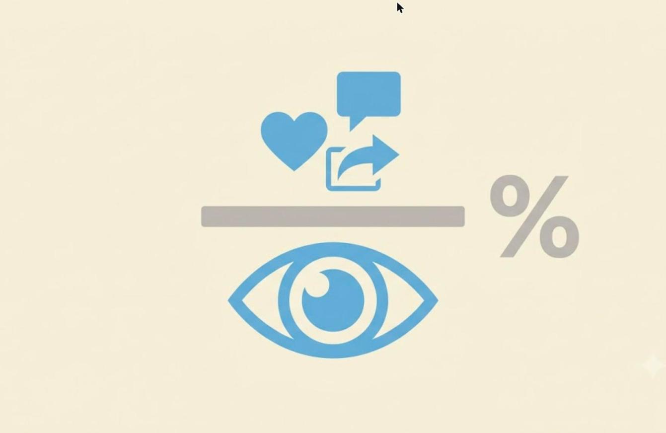
The engagement rate is the ratio between who interacted with a post — reactions, comments, shares — and who actually saw it. It’s a more honest measure than any raw number, because it accounts for the starting base: a post seen by few people but with a high engagement rate has still hit the mark, even if the absolute number of reactions stays low.
Why the rate matters more than the volume
Comparing two posts published at different times, with networks of different sizes or in different periods of the year, only makes sense by looking at the engagement rate, not the raw number: a post with a hundred reactions out of two thousand impressions (5%) performed better than one with a hundred and fifty reactions out of eight thousand impressions (just under 2%), even if the second absolute number looks more impressive at first glance.
This becomes especially useful for understanding which topics or formats work best over time: comparing the average engagement rate of posts on one topic versus another clearly shows where it’s worth insisting and where your audience’s interest is more lukewarm, regardless of how many raw likes each topic collected.
A number to watch over time, not on a single post
A single post’s engagement rate naturally swings based on the topic, the day it’s published, even the general mood of your network at that moment — it isn’t a final verdict on one isolated post. It becomes a reliable signal when you look at it across several posts over time, looking for patterns that repeat, not isolated variations that may depend on random factors.
Quick check
What does the engagement rate measure?
It’s a ratio, not a raw number: it accounts for how many people actually saw the post.
Why is it worth looking at engagement rate across several posts over time, not on a single isolated post?
A single post can swing due to topic, day, or random factors: the pattern only emerges by looking at several posts together.
The profile has its own metrics, distinct from those of individual posts.
The reserved lessons unlock for free when you sign up — no paid plan needed.
Sign up free to continue →Every published post carries its own small report — often ignored after the first hours.
The reserved lessons unlock for free when you sign up — no paid plan needed.
Sign up free to continue →Numbers are there to guide your next choices, not to judge every single post.
The reserved lessons unlock for free when you sign up — no paid plan needed.
Sign up free to continue →